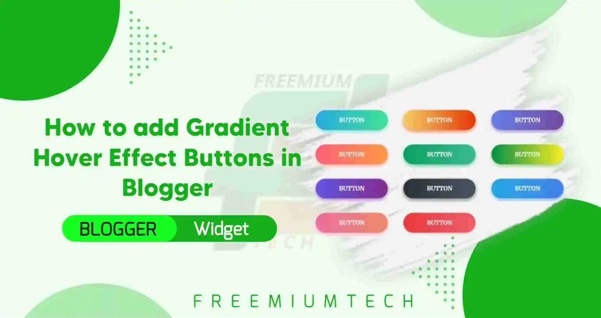
Hello Everyone! Welcome back to FreemiumTech, Toady on this occasion our tutorial is How to add Gradient Hover Effect Buttons in Blogger. Everyone likes Gradient Styles. Here the Top selection of Gradient Buttons that change the Background Color when Hovering on the button and it is very attractive and gives a feel while hovering on it.
Gradient Hover Effect?
Gradient Hover Effect Button contains vibrant colors and they look attractive when they are hovered. Shadow effects are used smartly to highlight the buttons from the background. Overall, it is a clean looking attractive gradient button collection. All you have to do is to pick the design you like and use it in your design.
Here are the selection of gradient buttons that change the background-color when hovering. You can change the direction of the background change in the :hover state. Don't forget to then also change the background-color direction in the button itself and please read full article.
How to add Gradient Hover Effect Buttons in Blogger?
Step 1: Login to your Blogger Dashboard
Step 2: Go to Themes
Step 3: Click on the Drop down arrow and select Edit HTML
Step 4: Now search for ]]> and paste the following CSS just above it.
You can use our CSS Minifier to minify this CSS and make this more lightweight
.btn-hover {
    width: 200px;
    font-size: 16px;
    font-weight: 600;
    color: #fff;
    cursor: pointer;
    margin: 20px;
    height: 55px;
    text-align:center;
    border: none;
    background-size: 300% 100%;
    border-radius: 50px;
    moz-transition: all .4s ease-in-out;
    -o-transition: all .4s ease-in-out;
    -webkit-transition: all .4s ease-in-out;
    transition: all .4s ease-in-out;}

.btn-hover:hover {
    background-position: 100% 0;
    moz-transition: all .4s ease-in-out;
    -o-transition: all .4s ease-in-out;
    -webkit-transition: all .4s ease-in-out;
    transition: all .4s ease-in-out;}

.btn-hover:focus {
    outline: none;}

.btn-hover.color-1 {
    background-image: linear-gradient(to right, #25aae1, #40e495, #30dd8a, #2bb673);
    box-shadow: 0 4px 15px 0 rgba(49, 196, 190, 0.75);}
.btn-hover.color-2 {
    background-image: linear-gradient(to right, #f5ce62, #e43603, #fa7199, #e85a19);
    box-shadow: 0 4px 15px 0 rgba(229, 66, 10, 0.75);}
.btn-hover.color-3 {
    background-image: linear-gradient(to right, #667eea, #764ba2, #6B8DD6, #8E37D7);
    box-shadow: 0 4px 15px 0 rgba(116, 79, 168, 0.75);}
.btn-hover.color-4 {
    background-image: linear-gradient(to right, #fc6076, #ff9a44, #ef9d43, #e75516);
    box-shadow: 0 4px 15px 0 rgba(252, 104, 110, 0.75);}
.btn-hover.color-5 {
    background-image: linear-gradient(to right, #0ba360, #3cba92, #30dd8a, #2bb673);
    box-shadow: 0 4px 15px 0 rgba(23, 168, 108, 0.75);}
.btn-hover.color-6 {
    background-image: linear-gradient(to right, #009245, #FCEE21, #00A8C5, #D9E021);
    box-shadow: 0 4px 15px 0 rgba(83, 176, 57, 0.75);}
.btn-hover.color-7 {
    background-image: linear-gradient(to right, #6253e1, #852D91, #A3A1FF, #F24645);
    box-shadow: 0 4px 15px 0 rgba(126, 52, 161, 0.75);}
.btn-hover.color-8 {
    background-image: linear-gradient(to right, #29323c, #485563, #2b5876, #4e4376);
    box-shadow: 0 4px 15px 0 rgba(45, 54, 65, 0.75);
}
.btn-hover.color-9 {
    background-image: linear-gradient(to right, #25aae1, #4481eb, #04befe, #3f86ed);
    box-shadow: 0 4px 15px 0 rgba(65, 132, 234, 0.75);}
.btn-hover.color-10 {
        background-image: linear-gradient(to right, #ed6ea0, #ec8c69, #f7186a , #FBB03B);
    box-shadow: 0 4px 15px 0 rgba(236, 116, 149, 0.75);}
.btn-hover.color-11 {
       background-image: linear-gradient(to right, #eb3941, #f15e64, #e14e53, #e2373f);  box-shadow: 0 5px 15px rgba(242, 97, 103, .4);}
Step 6: Click on the Pen icon in the top right corner and switch to HTML View
Step 7: Now copy and paste the given below codes
Add your links at #
<button class="btn-hover color-1" onclick="window.open('#')">Button</button>
<button class="btn-hover color-2" onclick="window.open('#')">Button</button>
<button class="btn-hover color-3" onclick="window.open('#')">Button</button>
<button class="btn-hover color-4" onclick="window.open('#')">Button</button>
<button class="btn-hover color-5" onclick="window.open('#')">Button</button>
<button class="btn-hover color-6" onclick="window.open('#')">Button</button>
<button class="btn-hover color-7" onclick="window.open('#')">Button</button>
<button class="btn-hover color-8" onclick="window.open('#')">Button</button>
<button class="btn-hover color-9" onclick="window.open('#')">Button</button>
<button class="btn-hover color-10" onclick="window.open('#')">Button</button>
<button class="btn-hover color-11" onclick="window.open('#')">Button</button>
Conclusion
In this post I have made a tutorial about How to add Gradient Hover Effect Buttons in Blogger, Which gives a colorful animation feel while hovering. I hope you have liked it and please share with your friends and follow our blog for more.If you face any problems in this code or have any questions so feel free to ask me in comments section or join our Telegram Groupfor discussion.


