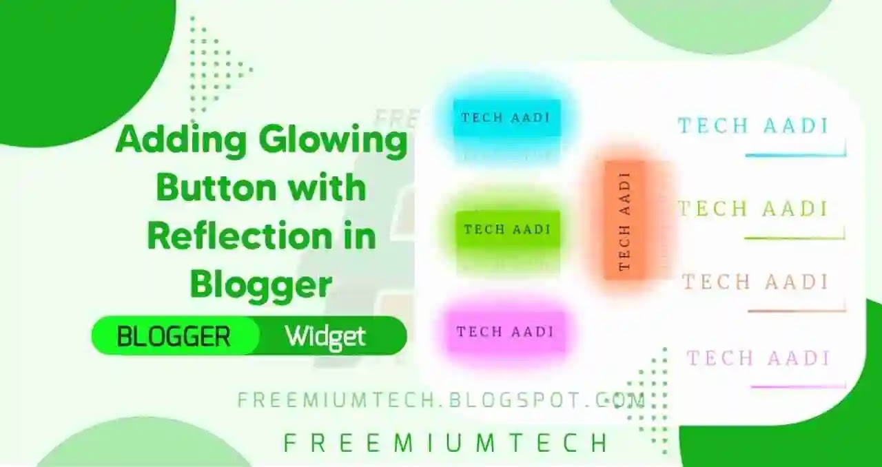
Hello Everyone! Welcome back to FreemiumTech, Toady on this occasion our tutorial is How to Add Glowing Button with Reflection in Blogger? Everyone likes colorful Styles. Here the Top selection of animated download Buttons that change the Background Color when click on the button and it is very attractive and gives a feel while click on it.
What is Glowing Button?
Benefits of Glowing Buttons :-
- Clean Optimized look.
- Overall Gentle Appearance.
- Glowing effect Design.
- Change your old buttons to this new style.
- Adds 3d Feel while Hovering on Buttons.
How to Add Glowing Button with Reflection in Blogger?
There are only one step you have to is add the CSS of button. After that you can perfectly use the button on your blog.
Step 1: Login to your Blogger Dashboard
Step 2: Go to Themes
Step 3: Click on the Drop down arrow and select Edit HTML
Step 4: Now search for ]]> or </body> and paste the following CSS just above it.
You can use our CSS Minifier to minify this CSS and make this more lightweight
/* Glowing Button Style by FreemiumTech */
<style type="text/css">
  but{position:relative;display:inline-block;padding:10px 10px;margin:40px;color:#03e9f4;text-decoration:none;text-transform:uppercase;transition:0.5s;letter-spacing:4px;overflow:hidden}but:hover{background:#03e9f4;color:#050801;box-shadow:0 0 5px #03e9f4,0 0 25px #03e9f4,0 0 50px #03e9f4,0 0 200px #03e9f4;-webkit-box-reflect:below 1px linear-gradient(transparent,#0005)}but span{position:absolute;display:block}but span:nth-child(1){top:0;left:0;width:100%;height:2px;background:linear-gradient(90deg,transparent,#03e9f4);animation:animate1 1.6s linear infinite}@keyframes animate1{0%{left:-100%}50%,100%{left:100%}}but span:nth-child(2){top:-100%;right:0;width:2px;height:100%;background:linear-gradient(180deg,transparent,#03e9f4);animation:animate2 1.6s linear infinite;animation-delay:0.40s}@keyframes animate2{0%{top:-100%}50%,100%{top:100%}}but span:nth-child(3){bottom:0;right:0;width:100%;height:2px;background:linear-gradient(270deg,transparent,#03e9f4);animation:animate3 1.6s linear infinite;animation-delay:0.80s}@keyframes animate3{0%{right:-100%}50%,100%{right:100%}}but span:nth-child(4){bottom:-100%;left:0;width:2px;height:100%;background:linear-gradient(360deg,transparent,#03e9f4);animation:animate4 1.6s linear infinite;animation-delay:1.20s}@keyframes animate4{0%{bottom:-100%}50%,100%{bottom:100%}}
</style>
Step 5 : Now add the Below button codes in your Particular Post/Page
Below are the demo with codes for using the button. Copy the code from below buttons when you want to use any button on your blog.Add your links at #
 <center>
  <but onclick="window.open('https://FreemiumTech.blogspot.com/?m=1')" style="filter: hue-rotate(110deg)" target="blank">
    <span></span>
    <span></span>
    <span></span>
    <span></span>
    Freemium Tech
  </but>
</center>
 <center>
  <but onclick="window.open('https://freemiumtech.blogspot.com/?m=1')" style="filter: hue-rotate(190deg)" target="blank">
    <span></span>
    <span></span>
    <span></span>
    <span></span>
    Freemium Tech
  </but>
</center>
 <center>
  <but onclick="window.open('https://freemiumtech.blogspot.com/?m=1')" target="blank">
    <span></span>
    <span></span>
    <span></span>
    <span></span>
    Freemium Tech
  </but>
</center>
 <center>
  <but onclick="window.open('https://freemiumtech.blogspot.com/?m=1')" style="filter: hue-rotate(270deg)" target="blank">
    <span></span>
    <span></span>
    <span></span>
    <span></span>
    Freemium Tech
  </but>
</center>


